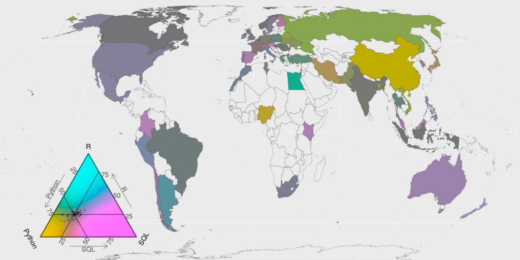
Last year I participated to the Kaggle survey data challenge. The challenge objective: tell a data story about a subset of the data science community represented in this survey, through a combination of both narrative text and data exploration. I used this opportunity to build ternary choropleth maps with {ggtern} and {tricolore}.
Choice of the story
I hope that my blog is obvious enough to show that I am a R developer who like maps. As a data scientist, I am also highly concerned about communication and reproducibility of studies. These specificities will drive my motivation for the exploration of the Kaggle survey dataset.
I will try to see if there are worldwide geographical disparities in the panel of respondents. I will focus on the most used programming languages as answered by the respondents. By coincidence, R is one of them.
# Path to data
# extraWD <- file.path("data/")
path <- extraWD
R packages used
I use different R packages for data manipulation and for cartography. New ones for me are {ggtern}, {tricolore} and {rnaturalearth}.
library(readr)
library(tidyr)
library(maps)
library(mapdata)
library(maptools) # required to transform map object as sf
library(dplyr)
library(ggplot2)
library(sf)
library(purrr)
library(stringr)
library(mapview)
library(glue)
library(tricolore)
library(forcats)
library(ggtern)
library(rnaturalearth)
Custom Color palettes
I define my own color palettes for the following figures.
bluepal <- colorRampPalette(
  c("#FFFFFF", "#D9F0F5", "#B2E2EC", "#8CD3E3", "#288EA5", "#1A5F6E"))
orangebluepal <- colorRampPalette(
  c(rev(c("#F8DFD8", "#F1C0B0", "#EBA18A", "#B4421E", "#782C14")),
    c("#FFFFFF", "#D9F0F5", "#B2E2EC", "#8CD3E3", "#288EA5", "#1A5F6E")))
catpal <- c("#DE633C", "#41B7D1", "#A6AAAB", "#FF9919", "#C0504D", "#5B5960", "#EEECE1")

par(mfrow = c(1, 3))
barplot(rep(1, 6), col = bluepal(6), space = 0)
barplot(rep(1, 6), col = orangebluepal(6), space = 0)
barplot(rep(1, 7), col = catpal, space = 0)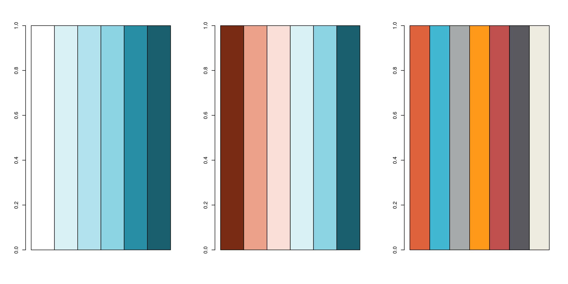
Read and select data
I chose to work with the multiple choice responses that contain information on the country of origin, so that we can draw maps.
mcr <- read_csv(file.path(path, 'multipleChoiceResponses.csv'), skip = 1) Clean column names and regex
To simplify manipulation of questions of my interest, I reduced column names. I used some regex to extract language names in multiple choices (and open) questions to be able to retrieve them more easily in the exploration. String manipulation is easy with {stringr} and powerful when you get regular expressions…
## Programming languages
questions <- tibble(value = names(mcr)) %>%
  mutate(col_name = case_when(
    grepl("In which country", value) ~ "country",
    grepl("What is your age (# years)?", value) ~ "age",
    grepl("What programming languages do you use", value) ~
      paste0("lang_use_all_", str_extract(value, '(?<=Choice - )(\\w*\\s*[:graph:]*)*$')),
    grepl("What specific programming language do you use most often?", value) ~ "lang_use_often",
    grepl("What programming language would you recommend", value) ~ "lang_recommend",
    grepl("primary tool", value) ~ paste0("tool_", str_extract(value, '(?<= - )(.*)(?= - Text$)')),
    grepl("IDE", value) ~ paste0("IDE_", str_extract(value, '(?<=Choice - )(\\w*\\s*[:graph:]*)*$')),
    grepl("your work easy to reproduce", value) ~ paste0("repro_how_", str_extract(value, '(?<= Choice - )(\\w*\\s*[:graph:]*)*$')),
    grepl("reuse and reproduce", value) ~ paste0("repro_barrier_", str_extract(value, '(?<= Choice - )(\\w*\\s*[:graph:]*)*$')),
    grepl("which specific data visualization library", value) ~ "dataviz_often",
    grepl("Which types of data", value) ~ paste0("datatype_all_", str_extract(value, '(?<= Choice - )(\\w*\\s*[:graph:]*)*$')),
    grepl("What is the type of data", value) ~ "datatype_often",
    # grepl("cloud computing services"),
    TRUE ~ value
  ))

# Duplicated colnames are open answers
questions$col_name[duplicated(questions$col_name)] <-
  paste0(questions$col_name[duplicated(questions$col_name)], "_open")

names(mcr) <- questions$col_name

# Clean names
questions
## # A tibble: 395 x 2
## value col_name
## <chr> <chr>
## 1 Duration (in seconds) Duration (in seconds)
## 2 What is your gender? - Selected Choice What is your gender? - Selected Choice
## 3 What is your gender? - Prefer to self… What is your gender? - Prefer to self…
## 4 What is your age (# years)? age
## 5 In which country do you currently res… country
## 6 What is the highest level of formal e… What is the highest level of formal e…
## 7 Which best describes your undergradua… Which best describes your undergradua…
## 8 Select the title most similar to your… Select the title most similar to your…
## 9 Select the title most similar to your… Select the title most similar to your…
## 10 In what industry is your current empl… In what industry is your current empl…
## # … with 385 more rowsPrepare maps for joining by countries names
I like to use package {sf} to manipulate spatial data (You can find out more on how to use it with my quick tutorial on {sf}). In the first version of this article, I used the “world” map included in R package {maps} as the background of figures. To do so, I had to partially modify {sf} function st_as_sf for the map object to be able to retrieve countries and regions names before building a simple feature spatial object. Original st_as_sf function can deal with {map} files but only retrieve “region”.
# Get world map data
worldmap <- maps::map("world", fill = TRUE, plot = FALSE)

# Rewrite st_as_sf for map object to get subregions
st_as_sf.map <- function(x, ...) {
  # browser()
    ID0 = vapply(strsplit(x$names, ":"), function(y) y[1], "")
    ID1 = vapply(strsplit(x$names, ":"), function(y) y[2], "")
    ID_unique <- 1:length(ID0)
    m.sp = maptools::map2SpatialPolygons(x, IDs = ID_unique, proj4string = sp::CRS("+init=epsg:4326"))
    m = st_as_sf(m.sp)
    m$ID = as.numeric(vapply(m.sp@polygons, function(x) slot(x, "ID"), ""))
    m$region = ID0[m$ID]
    m$subregion = ID1[m$ID]
m
}

# Transform to Winkel tripel projection for World representation
worldmap_sf <- worldmap %>%
  st_as_sf.map()

plot(worldmap_sf)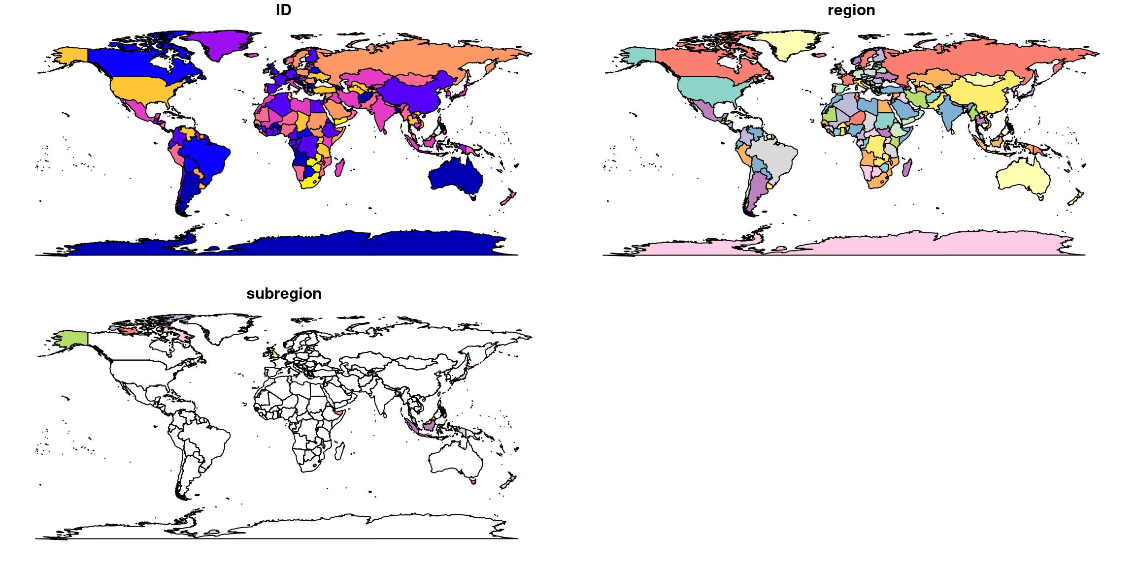
The {sf} transformation of a {maps} object works as expected. However, it is better to represent world maps with a projection having the smaller possible distortion. Thus, I decided to use the new Equal Earth projection. As explained in Matt Strimas-Mackey blog post (Google cache version), Equal Earth projection is now available in the last versions of proj. I work on Ubuntu and my main resource for linux spatial related tools is the UbuntuGIS PPA. Thanks to the wonderful work of this small UbuntuGIS team, the 5.2 version of proj is available for my (bionic) distribution. I wrote a tutorial on ThinkR blog if you want to know how to install R and spatial packages on Ubuntu 18.04.
Whatever, the problem is that the projection of my world map is not perfect.
worldmap_sf %>%
  st_transform("+proj=eqearth +wktext") %>%
  ggplot() + geom_sf()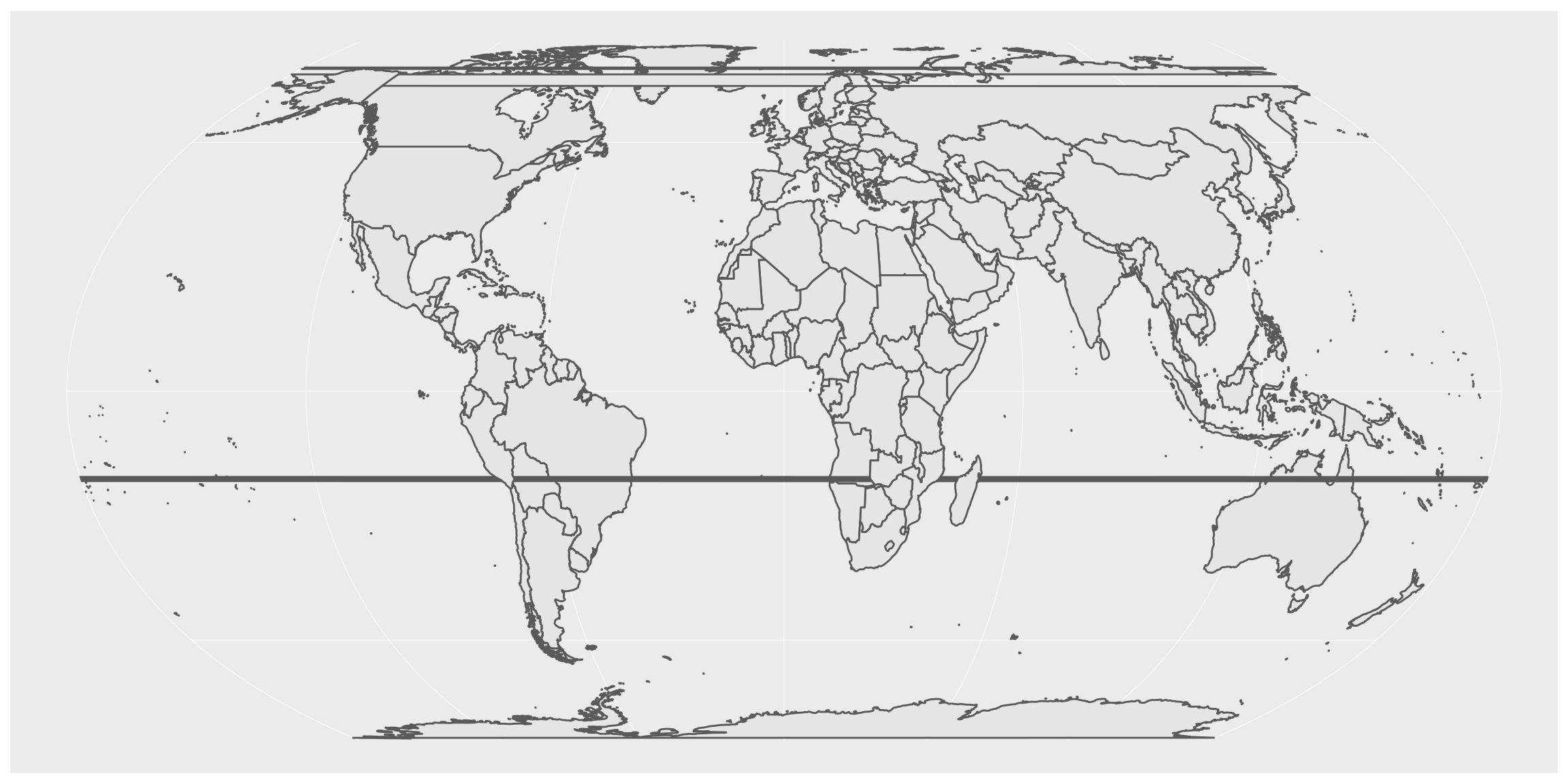
Thus, in this new version (compared to kaggle submission), I changed my source of dataset to use world map from {rnaturalearth}, which, by the way, can be returned as {sf} format directly.
EDIT: There is a conflict between {ggtern} and {ggplot2} that requires to set geom_sf(aes(geometry = geometry)). I opened an issue here
ne_world <- rnaturalearth::ne_countries(scale = 50, returnclass = "sf")

world_eqe <- ne_world %>%
  st_transform("+proj=eqearth +wktext")
world_eqe %>%
ggplot() +
geom_sf()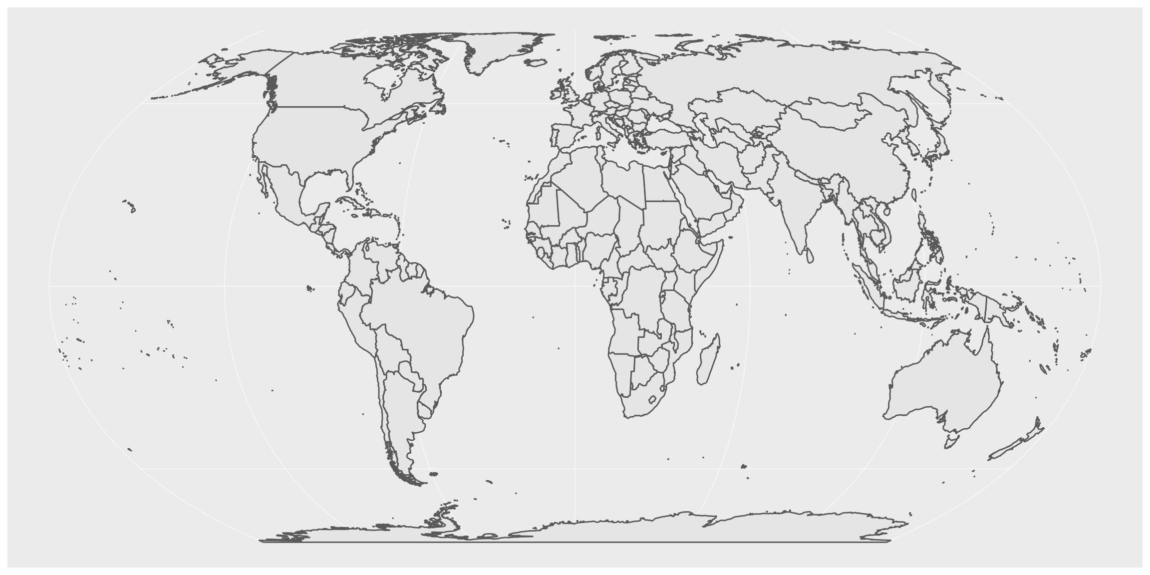
I modified countries names so that they are named identically in the map and in the dataset. People who chose “Other” or “I do not wish to disclose my location” will not be map.
# List countries not written identically in both datasets
mcr %>%
  mutate(is_in_map = country %in% world_eqe$name_long) %>%
  filter(!is_in_map) %>%
  pull(country) %>%
  unique()
## [1] "United States of America"
## [2] "Other"
## [3] "Iran, Islamic Republic of..."
## [4] "United Kingdom of Great Britain and Northern Ireland"
## [5] "Russia"
## [6] "I do not wish to disclose my location"
## [7] "South Korea"
## [8] "Hong Kong (S.A.R.)"
## [9] "Viet Nam"# Rename countries on the map for correspondance
world_eqe_country <- world_eqe %>%
mutate(country = case_when(
name_long == "Republic of Korea" ~ "South Korea",
subunit == "Hong Kong S.A.R." ~ "Hong Kong (S.A.R.)",
name_long == "Vietnam" ~ "Viet Nam",
# sovereignt == "Czechia" ~ "Czech Republic",
name_long == "Russian Federation" ~ "Russia",
TRUE ~ name_long
))
# Rename countries in the data for correspondance
mcr_country <- mcr %>%
mutate(country = case_when(
country == "Republic of Korea" ~ "South Korea",
country == "United States of America" ~ "United States",
country == "United Kingdom of Great Britain and Northern Ireland" ~ "United Kingdom",
country == "Iran, Islamic Republic of..." ~ "Iran",
TRUE ~ country
))
# Test again # List countries not written identically in both datasets
# mcr_country %>%
# mutate(is_in_map = country %in% world_eqe_country$country) %>%
# filter(!is_in_map) %>%
# pull(country) %>%
# unique()Exploration
Number of answers by country
Let’s explore this dataset !
There are some big disparities in the panel of respondents. The most represented countries are USA and India. The map allows to see that very few of Africa’s countries are represented. The scale is a log scale, which means that disparities between countries is far higher than what we see here.
mcr_count <- mcr_country %>%
  count(country) %>%
  arrange(desc(n))

# Combine area with centroid to avoid under-represented countries
world_eqe_country %>%
  st_union(by_feature = TRUE) %>%
  group_by(country) %>%
  summarise(do_union = FALSE) %>%
  left_join(mcr_count, by = "country") %>%
  filter(!is.na(n)) %>%
  st_centroid(of_largest_polygon = TRUE) %>%
  ggplot() +
  # geom_sf(data = worldmap_sf %>% left_join(mcr_count, by = "country"), aes(fill = n)) +
  geom_sf(data = world_eqe_country, fill = "black") +
  geom_sf(aes(colour = n, size = n), show.legend = "point") +
  scale_colour_gradientn("n", colours = bluepal(6), trans = "log10") +
  scale_fill_gradientn("n", colours = bluepal(6), trans = "log10") +
  scale_size(trans = "log10", range = c(0.5, 5)) +
  coord_sf(crs = st_crs(world_eqe_country)) +
  ggtitle("Number of answers by country (log scale)") +
  theme(panel.background = element_rect(fill = "#383838"))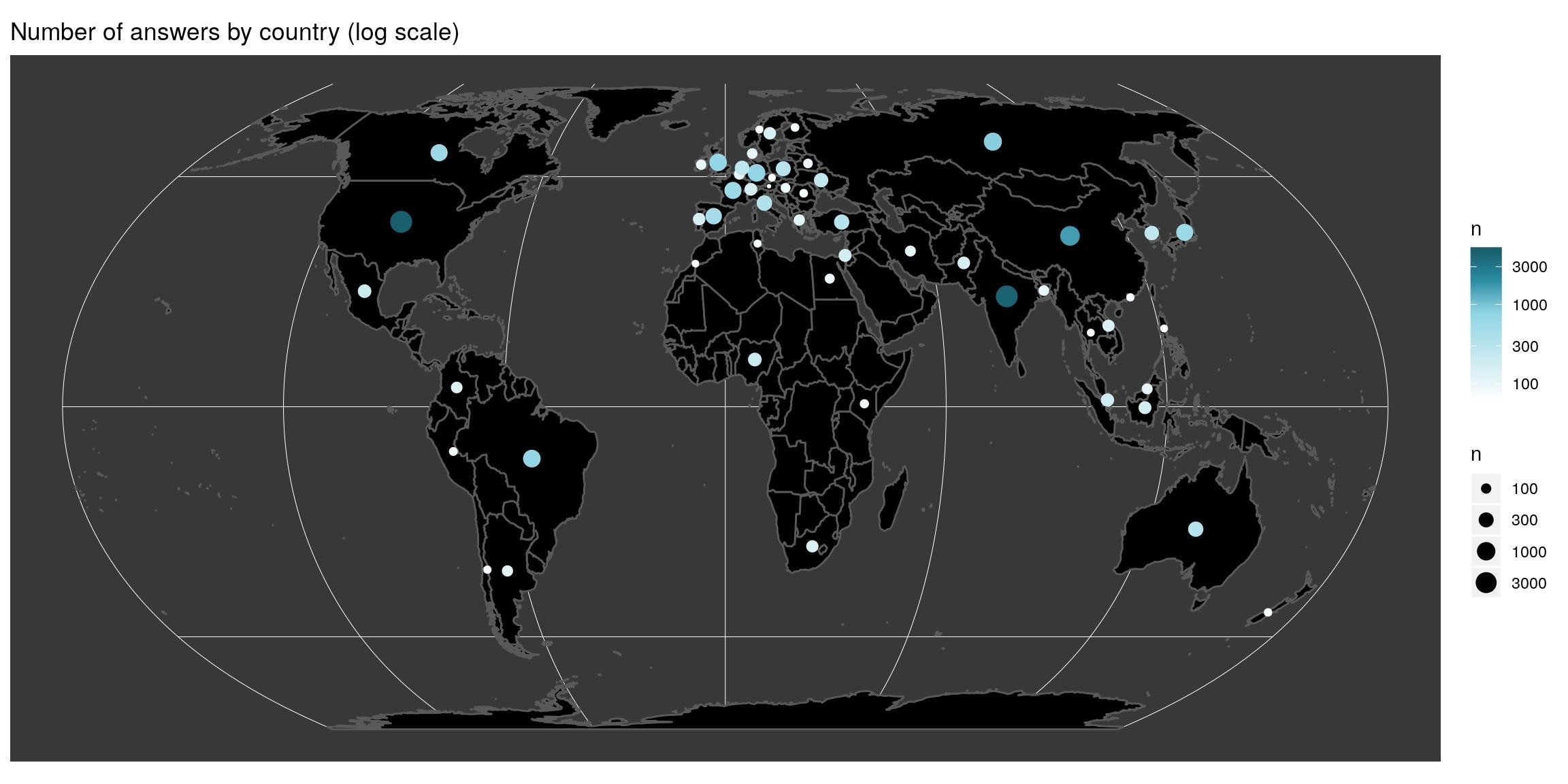
Function to create ternary balance map
When the ternary balance is highly drive by one of the three possibilities, output color seems homogeneous. In the following, I want to highlight areas with departures from the world average answer. To do so, I have to calculate the average and adjust the standard deviation of the (tri-)colorscale to the one of the data. Function below answers this problem.
#' Create ternary map
#' @param most data.frame with columns named value and n
#' @param q_country data.frame with country and value columns
#' @param p_legend Vector of 3 names for triangle legend
#' @param join_map The sf map to join dataset with
#' @param title title of the graph
#' @param top indices of the three values to keep
map_triangle <- function(most, q_country, p_legend, join_map, title, top = 1:3) {
 # browser()
  # clean_names <- most$value[top] %>%
  #   make.names()
  #
  # Keep only three indices
  top <- top[1:3]
  # Number of respondant by country of three most used
  x_country <- q_country %>%
    filter(value %in% most$value[top]) %>%
    count(country, value)

  x_country_spread <- x_country %>%
    spread(value, n) %>%
    mutate_at(vars(most$value[top]), list(~ifelse(is.na(.), 0, .))) # dplyr >= 0.8
    # mutate_at(vars(most$value[top]), funs(ifelse(is.na(.), 0, .))) # dplyr < 0.8

  # Whole data mean
  center <- apply(x_country_spread %>% select(most$value[top]), 2, mean)
  center <- center / sum(center)

  # As spatial
  x_sf <- x_country_spread %>%
    left_join(join_map, ., by = "country")

  # Scaling factor
  sum_prop <- t(apply(x_country_spread %>% select(most$value[top]), 1, function(x) x/sum(x)))
  mins <- apply(sum_prop, 2, min)
  zoomed_side <- (1 - (mins[2] + mins[3])) - mins[1]
  true_spread <- 1 / zoomed_side

  # Triangle colors
  triangle <- Tricolore(x_sf, p1 = most$value[top][1], p2 = most$value[top][2], p3 = most$value[top][3],
                        label_as = "pct", center = center,
                        spread = true_spread)
  # Triangle legend
  triangle_legend <- triangle$key +
    labs(L = p_legend[1], T = p_legend[2], R = p_legend[3]) +
    theme(
      tern.axis.arrow.show = TRUE,
      plot.background = element_rect(fill = NA, color = NA),
      axis.title = element_text(size = 10))

  # Map
  x_sf %>%
    mutate(rgb = triangle$rgb) %>%
    ggplot() +
    geom_sf(aes(fill = rgb), size = 0.1) +
    coord_sf(crs = st_crs(x_sf)) +
    scale_fill_identity() +
    # triangle scale annotation
    annotation_custom(
      ggtern::ggplotGrob(triangle_legend),
      xmin = st_bbox(x_sf)[1] + 0.01*(st_bbox(x_sf)[3] - st_bbox(x_sf)[1]),
      xmax = st_bbox(x_sf)[1] + 0.35*(st_bbox(x_sf)[3] - st_bbox(x_sf)[1]),
      ymin = st_bbox(x_sf)[2] + 0.01*(st_bbox(x_sf)[4] - st_bbox(x_sf)[2]),
      ymax = st_bbox(x_sf)[2] + 0.50*(st_bbox(x_sf)[4] - st_bbox(x_sf)[2])
    ) +
    ggtitle(c(title, ""))
}
R, python or SQL?
Language used
I used the multiple choice question “What programming languages do you use” to find out the three most used programming languages. According to respondents, these are Python, SQL and R.
lang_country <- mcr_country %>%
  select(country, starts_with("lang_use_all")) %>%
  gather(key, value, -country) %>%
  filter(value != -1)

# most_used
most_used <- lang_country %>%
  count(value) %>%
  filter(!is.na(value)) %>%
  arrange(desc(n))

most_used
## # A tibble: 322 x 2
## value n
## <chr> <int>
## 1 Python 15711
## 2 SQL 8267
## 3 R 6685
## 4 C/C++ 4383
## 5 Java 3999
## 6 Javascript/Typescript 3249
## 7 Bash 2708
## 8 MATLAB 2652
## 9 C#/.NET 1670
## 10 Visual Basic/VBA 1274
## # … with 312 more rowsI know SQL may not be used in the same context than python or R, but we can still look at the balance between these three. And let’s explore the balance geographically. We calculate the total number of time each language was chosen, separately in each country. The map shows the repartition among these three highest used languages. Colors shows departures from the average (Note the balance of colours in the triangle legend. It is turned toward the average answer). Of course, the balance is biased towards python, but there are a few countries with a higher proportion of R (blue-ish) and SQL (pink-ish) than the world average.
map_triangle(most = most_used, q_country = lang_country,
             p_legend = c('Python', 'R', 'SQL'),
             join_map = world_eqe_country,
             title = "Proportion of respondant by country of first three languages used",
             top = 1:3)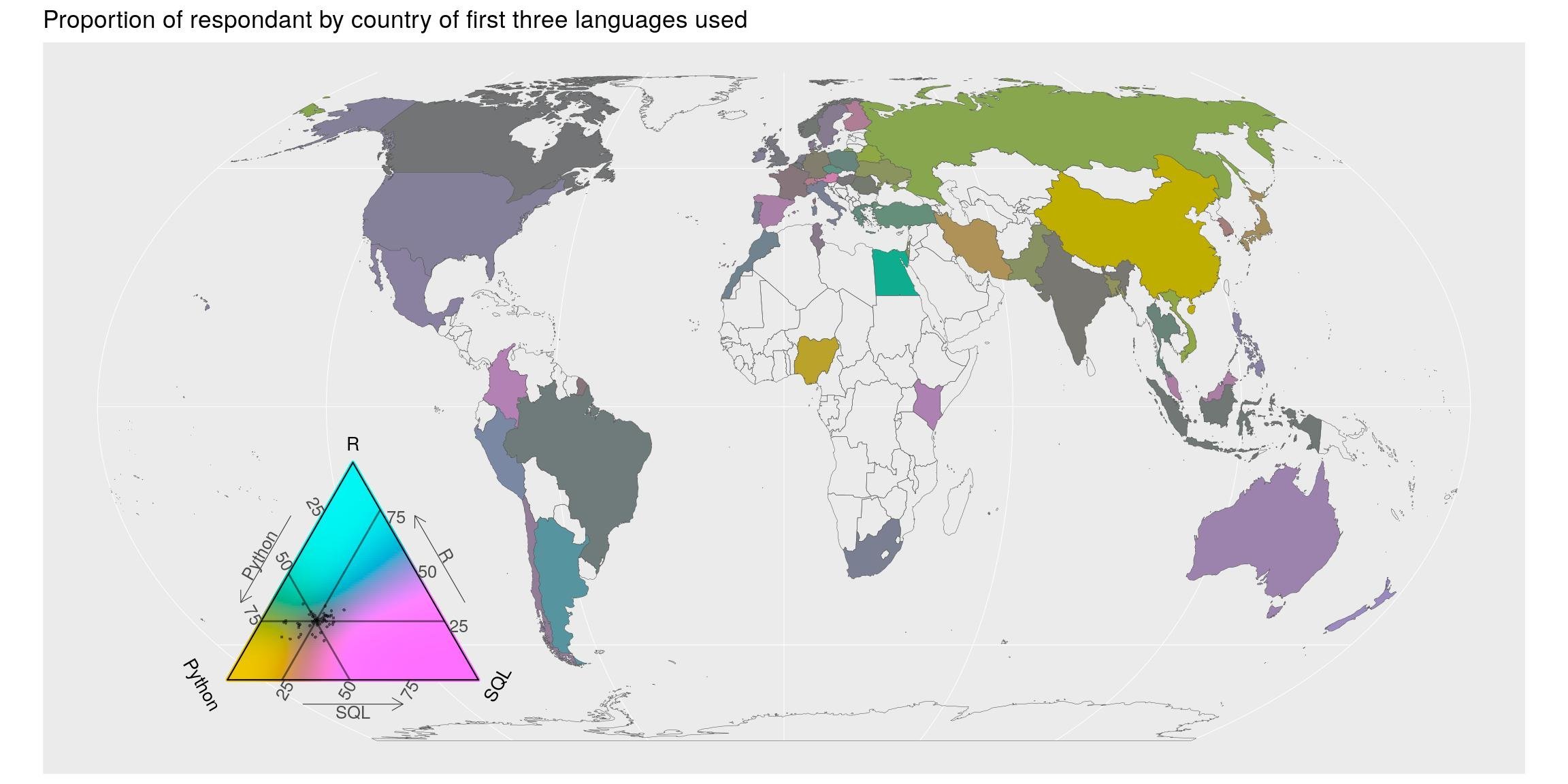
Language most often used
Previous question listed all languages used. In question “What specific programming language do you use most often?”, there is only one possible answer. In this case, python is still first but R is second, before SQL.
lang_often_country <- mcr_country %>%
  select(country, starts_with("lang_use_often")) %>%
  gather(key, value, -country) %>%
  filter(!is.na(value))

# most_often
most_often <- lang_often_country %>%
  count(value) %>%
  arrange(desc(n))

most_often
## # A tibble: 90 x 2
## value n
## <chr> <int>
## 1 -1 23746
## 2 Python 8180
## 3 R 2046
## 4 SQL 1211
## 5 Java 903
## 6 C/C++ 739
## 7 C#/.NET 432
## 8 Javascript/Typescript 408
## 9 MATLAB 355
## 10 SAS/STATA 228
## # … with 80 more rowsThe map shows the proportion of first-language used among respondents of each country. Colors shows departures from the average. Geographically speaking, there seem to be a higher proportion of python-first users in Russia and China. European, Oceanian show more R-users than the world average whereas America and Australia are more R+SQL users than the world average. Again, note the balance of colours in the triangle legend. They are turned toward the average answer.
map_triangle(
  most = most_often, q_country = lang_often_country,
  p_legend = c('Python', 'R', 'SQL'),
  join_map = world_eqe_country,
  title = "Proportion of language most often used among the three first languages",
  top = 2:4)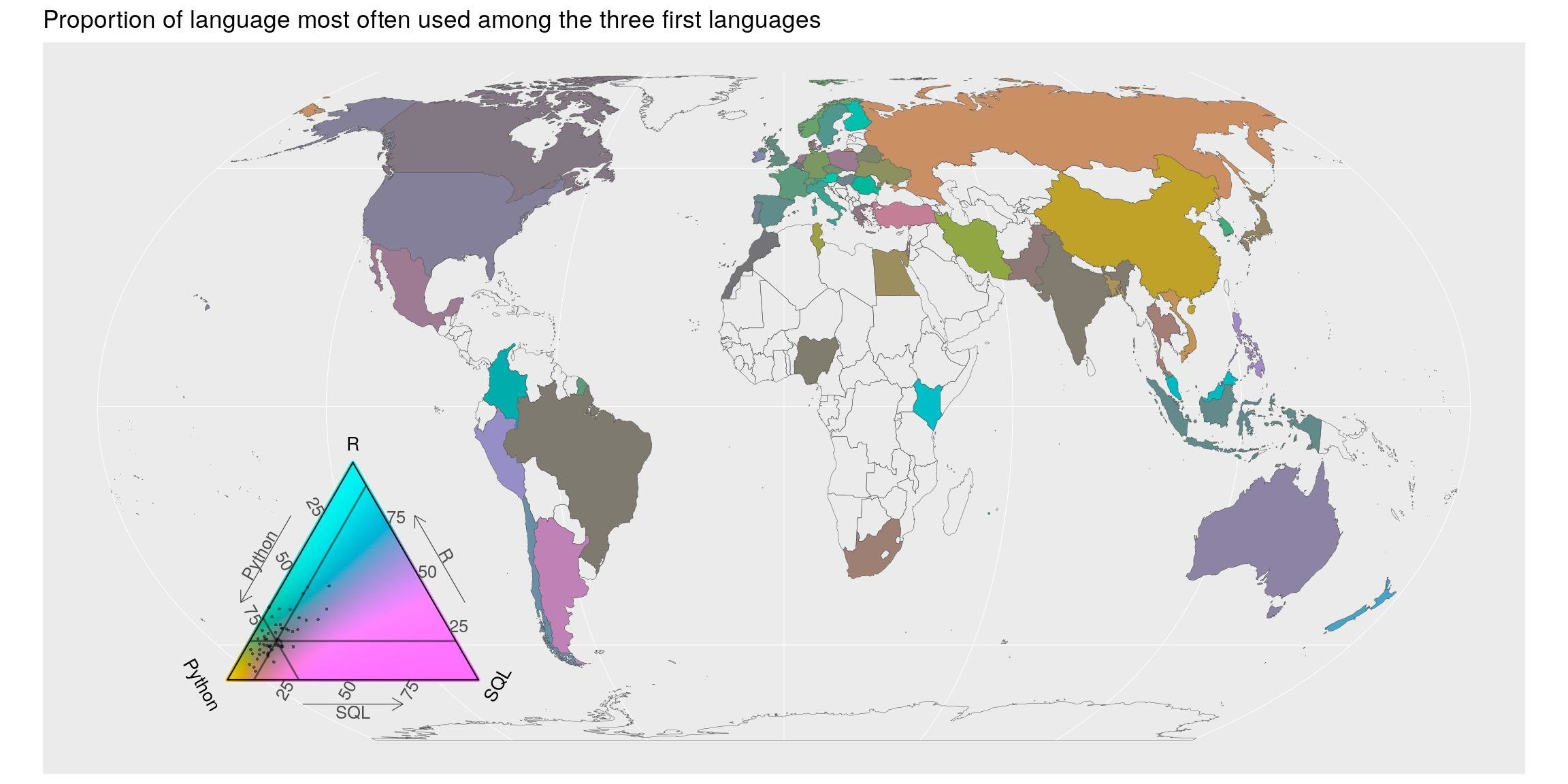
Language recommended
As of personal interest, I wanted to know if developers were more keen to recommend their own preferred language. Let’s see the top 10 languages recommended by users of the top 6 languages used (-1 = none, included).
lang_often_country <- mcr_country %>%
  select(country,  starts_with("lang_use_often"), starts_with("lang_recommend")) %>%
  mutate(lang_use_often = ifelse(is.na(lang_use_often)|lang_use_often == "Other", lang_use_often_open, lang_use_often),
         lang_recommend = ifelse(is.na(lang_recommend)|lang_recommend == "Other", lang_recommend_open, lang_recommend))

lang_often_country %>%
  group_by(lang_use_often, lang_recommend) %>%
  summarise(nb = n()) %>%
  left_join(most_often, by = c("lang_use_often" = "value")) %>%
  arrange(desc(nb)) %>%
  mutate(prop = nb/n) %>%
  # filter(prop < 1, n > 100) %>%
  group_by(lang_use_often) %>%
  top_n(10) %>%
  arrange(desc(prop)) %>%
  mutate(recommend = paste(lang_use_often, lang_recommend, sep = " => ")) %>%
  mutate(recommend = fct_reorder(recommend, prop)) %>%
  filter(lang_use_often %in% most_often$value[1:6]) %>%
  ggplot() +
  geom_col(aes( fct_reorder(recommend, prop), prop, fill = prop)) +
  coord_flip() +
  scale_fill_gradientn("prop", colours = bluepal(6)) +
  facet_wrap(~fct_reorder(lang_use_often, nb), scales = "free_y") +
  labs(x = "", y = "", title = "Language recommendation knowing most used language") +
  theme_bw() +
  theme(panel.background = element_rect(fill = "#292929"),
        panel.grid.major.y = element_blank(),
        panel.grid.minor.x = element_blank()
  )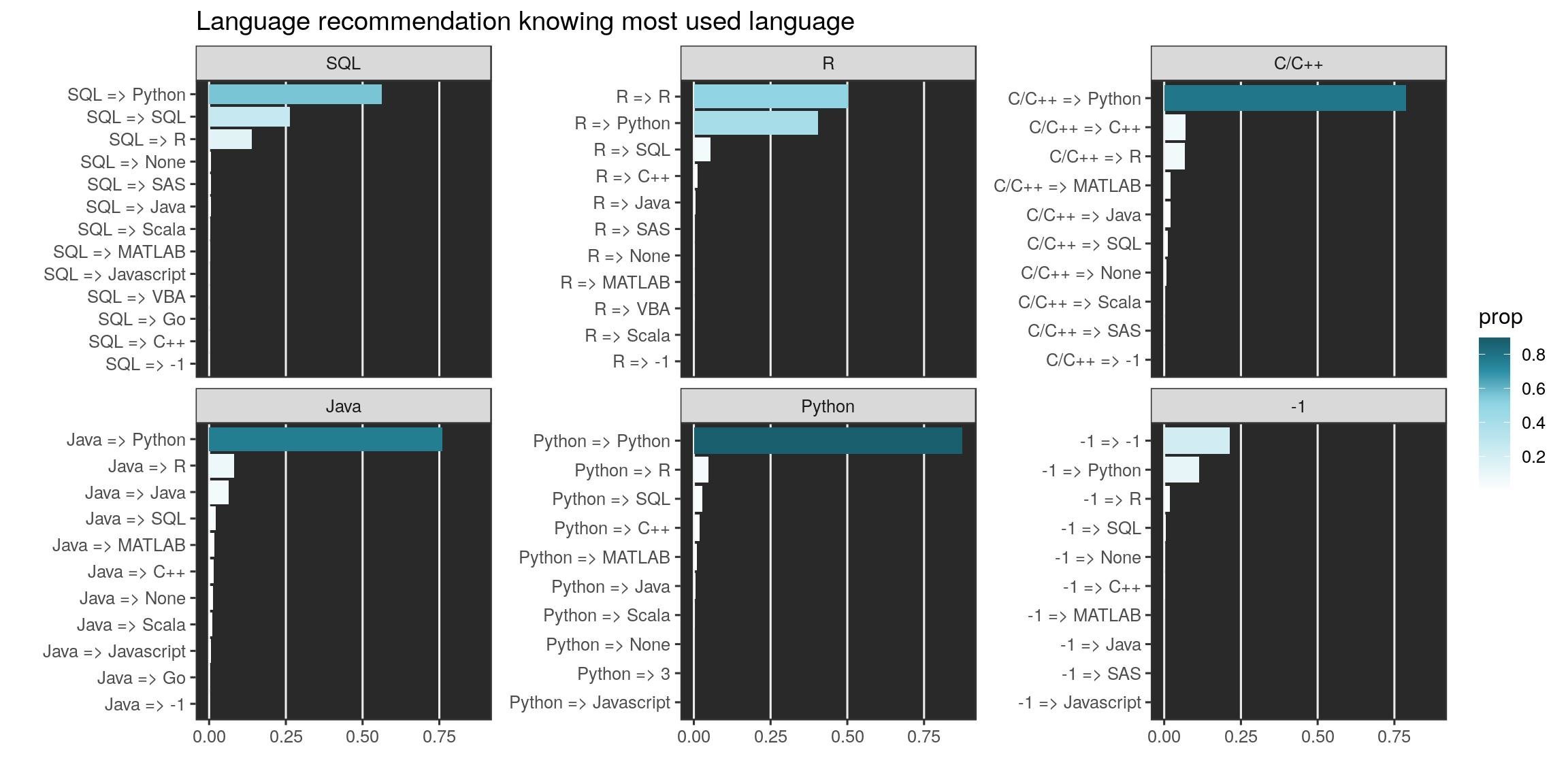
We can focus on the first six languages most used (-1 is for no language). Except for R users, developers of this panel would recommend python. Python users almost only recommend python. Propositions of R users is more balanced as is the one of SQL users.
lang_often_country %>%
  group_by(lang_use_often, lang_recommend) %>%
  summarise(nb = n()) %>%
  mutate(lang_summary = case_when(
    lang_use_often == lang_recommend ~ lang_recommend,
    lang_recommend %in% most_often$value[1:6] ~ lang_recommend,
    TRUE ~ "Other"
    )) %>%
  filter(lang_use_often %in% most_often$value[1:6]) %>%
  left_join(most_often, by = c("lang_use_often" = "value")) %>%
  arrange(desc(nb)) %>%
  ggplot() +
  geom_bar(aes(fct_reorder(lang_use_often, n), nb,
               fill = fct_reorder(lang_summary, nb)),
           stat = "identity", position = "fill") +
  coord_flip() +
  scale_fill_manual("most\nrecommended", values = catpal) +
  labs(x = "Most used language", y = "Proportion", title = "Language recommendation knowing most used language") +
  theme(legend.position = "bottom") +
  theme_bw()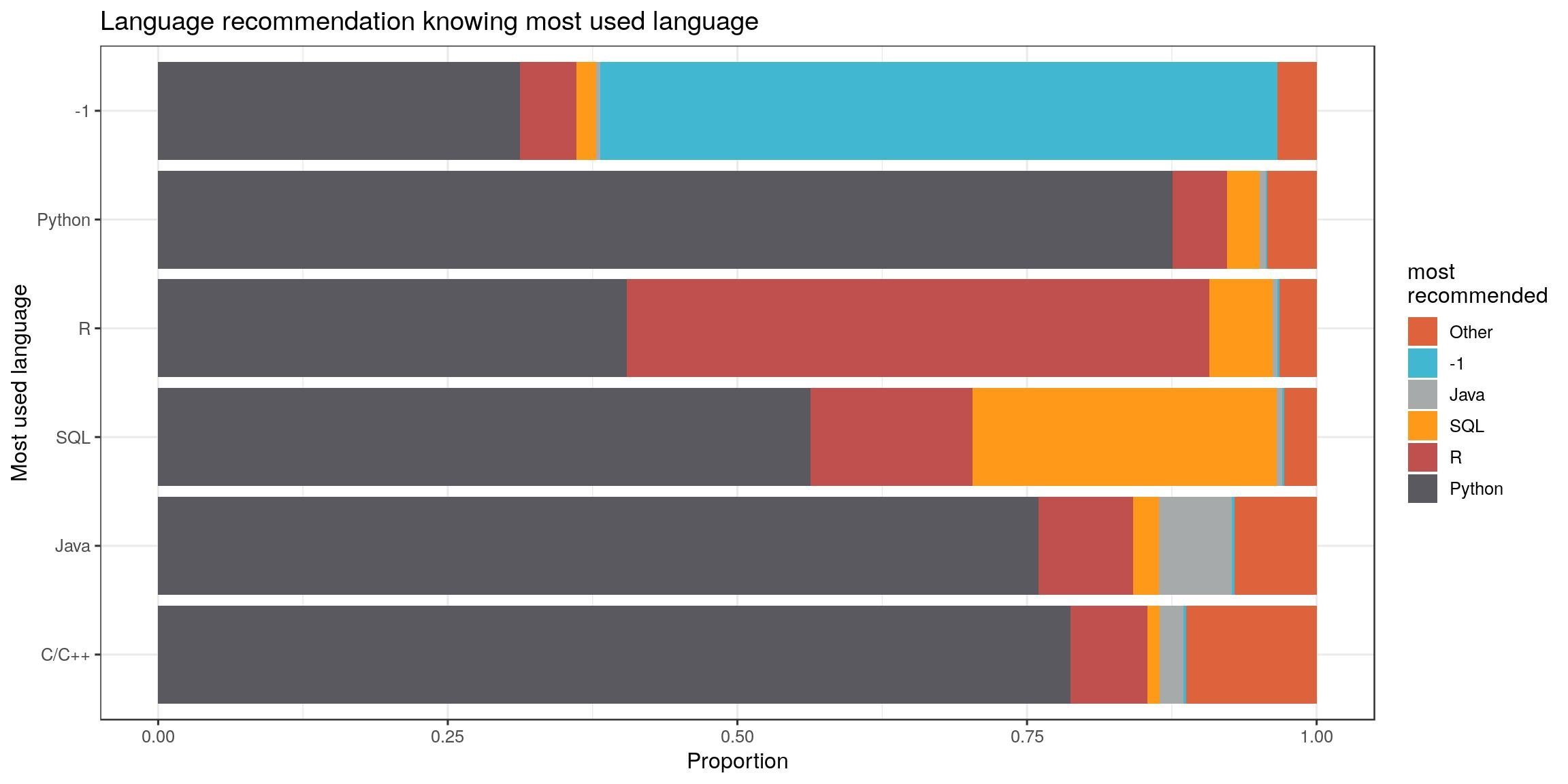
Reproducibility - good ways
What do the respondents think about the good ways for reproducibility?
Documentation is the first answer. I would answer the same, which is a reason why I use to recommend a “Rmarkdown-first approach” for data analyses but also for (R-package) development. This forces developers to think about users, but also to themselves in a few months…
Second one is a “human-readable code”. If respondents were only R users, I would say that Rstudio did a great job making people realizing that readable code is much easier to understand. But here, majority of respondents are python developers, which suggests that readability is of concern for other languages too. The {tidyverse} is going in the right direction apparently.
repro_how_country <- mcr_country %>%
  select(country, starts_with("repro_how_")) %>%
  gather(key, value, -country) %>%
  filter(!is.na(value))

# most_repro_how
most_repro_how <- repro_how_country %>%
  count(value) %>%
  arrange(desc(n))

most_repro_how
## # A tibble: 181 x 2
## value n
## <chr> <int>
## 1 -1 23689
## 2 Make sure the code is well documented 8052
## 3 Make sure the code is human-readable 7781
## 4 Share code on Github or a similar code-sharing repository 5636
## 5 Define all random seeds 4614
## 6 Share both data and code on Github or a similar code-sharing repository 4566
## 7 Include a text file describing all dependencies 4366
## 8 Define relative rather than absolute file paths 3665
## 9 Share data, code, and environment using a hosted service (Kaggle Kerne… 2945
## 10 Share data, code, and environment using containers (Docker, etc.) 2680
## # … with 171 more rowsLet’s map this for the 3 first recommended methods (except value = -1). Except for a few countries, all the three first ways are important: the proportion is ~1/3 for everyone (grey color). Respondents of the blue-ish countries, mainly situated in Europe, think the third answer (sharing code) is a little less important.
map_triangle(
  most = most_repro_how, q_country = repro_how_country,
  p_legend = c('a1', 'a2', 'a3'),
  join_map = world_eqe_country,
  title = "Proportion of the three best ways for reproducibility",
  top = 2:4)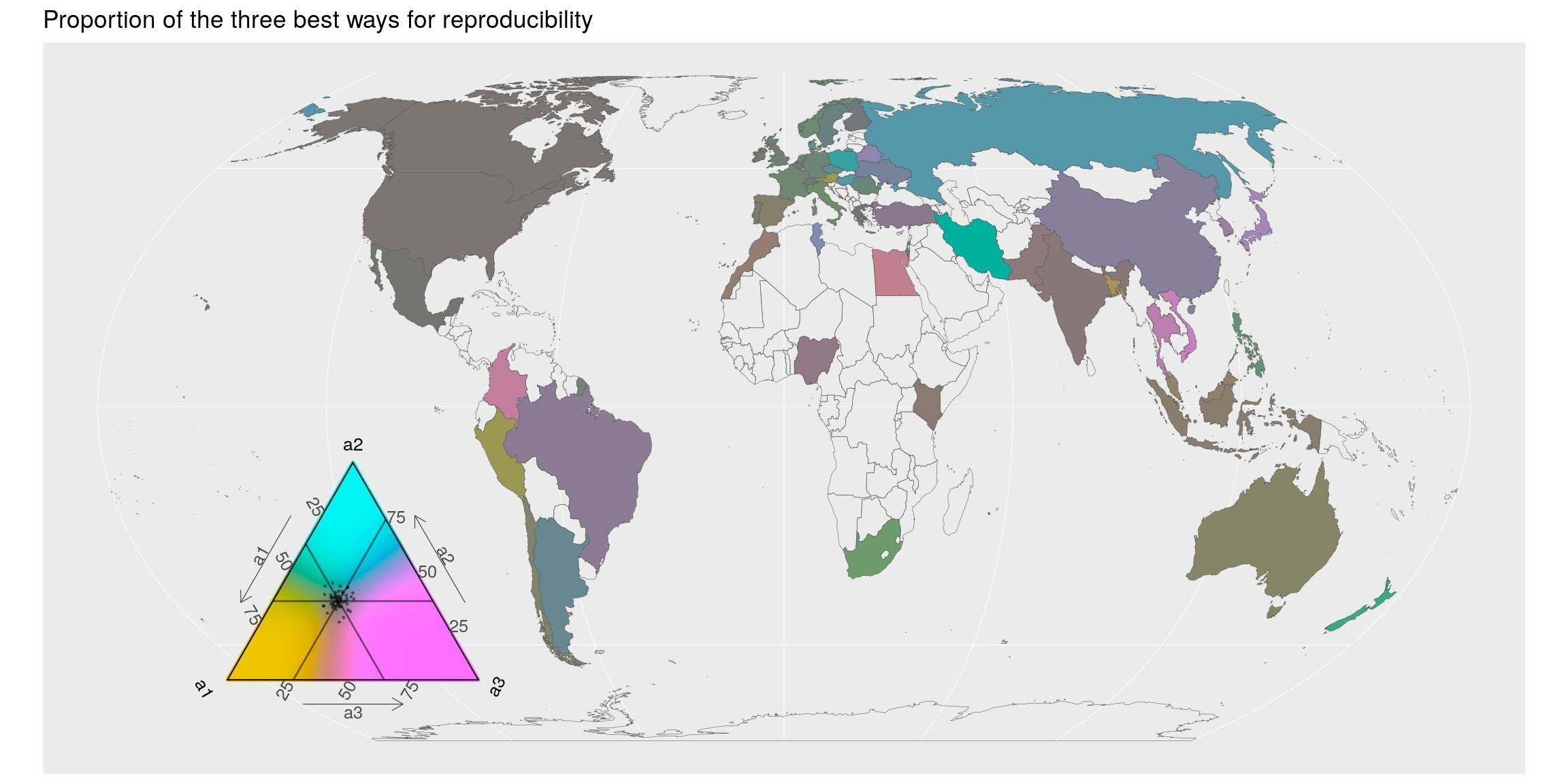
Reproducibility - barriers
What do they think about the barriers to reproducibility ?
Ensuring a certain reproducibility is time-consuming. Indeed. If you spend time writing documentation, you are not developing. But isn’t it worth it ?
repro_barriers_country <- mcr_country %>%
  select(country, starts_with("repro_barrier_")) %>%
  gather(key, value, -country) %>%
  filter(!is.na(value))

# most_repro_how
most_barriers_how <- repro_barriers_country %>%
  count(value) %>%
  arrange(desc(n))

most_barriers_how
## # A tibble: 417 x 2
## value n
## <chr> <int>
## 1 -1 23428
## 2 Too time-consuming 6478
## 3 Not enough incentives to share my work 3569
## 4 Requires too much technical knowledge 2674
## 5 None of these reasons apply to me 2500
## 6 Afraid that others will use my work without giving proper credit 2104
## 7 Too expensive 1371
## 8 I had never considered making my work easier for others to reproduce 1059
## 9 Other 520
## 10 120 4
## # … with 407 more rowsSpatially, most countries agrees on the two first barriers. The technical knowledge barrier (pink-ish) seems to be more important for Africa, South Asia and Oceania.
Concerning R, I would say that with {rmarkdown}, documentation does not really require technical knowledge. However, I still see R users who never heard about Rmd documents. It is our duty to inform them and continue to communicate about it. This is such a life changer. Also, with {reticulate} or Apache arrow, python users are also able to use Rmarkdown documents. The future will probably be made of more workflows built with a combination of languages…
map_triangle(
  most = most_barriers_how, q_country = repro_barriers_country,
  p_legend = c('b1', 'b2', 'b3'),
  join_map = world_eqe_country,
  title = "Proportion of the three biggest barriers to reproducibility",
  top = 2:4)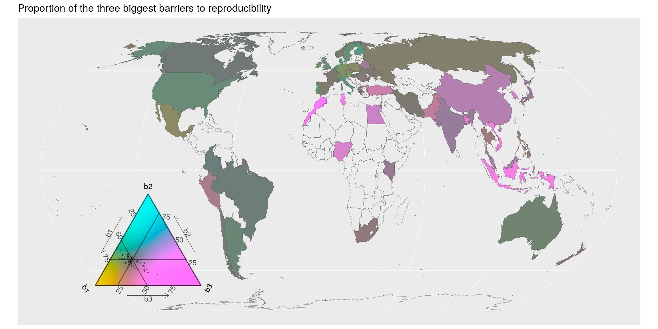
Discussion
To me, the exercise was more a new good reason to play with R packages that I did not know before. I will not draw big conclusions about this survey made on a specific panel of people, but it raises some interesting questions. Indeed, although the number of respondents is not equal among countries, there seem to be some patterns by continents on the answers.
Python is always the most used language among the respondents. R is just behind. These two are good languages for data science and machine learning. I am not surprised that they are among the most used ones.
However, I did not expect SQL to be such a represented language. It makes sense since huge datasets used for machine learning are usually stored in databases.
But today, languages like R (surely python too) makes it easy to interact with databases, as if they were simple csv files on our computer. Packages like {DBI}, {dbplyr}, {sparklyr} are good examples.
Hence, I would not be surprised if, in the future, the number of people really using SQL is lower among respondents of such machine learning users surveys.
By the way, maps shows some regional departures from the world average use of software like python. Europe and Oceania seem more keen to use R than America and even more than Asia. But I am not sure if you can conclude things about this without more understanding the profiles of respondents.
We should also try to understand why there are so few respondents in African countries. The technical barrier may be one of the answers, as suggested by the last map on reproducibility.
As for the ternary maps, I like to have the possibility to plot proportions between three categories, but I have a lot of difficulties to read the exact values of proportions in the triangle of colors…
Finally, I think my main satisfaction with this blog post is the use of a projection of the World map that is not the Mercator one !
The complete R script of this article can be found on my Blog Tips Github repository.
Citation:
For attribution, please cite this work as:
Rochette Sébastien. (2019, Mar. 20). "Kaggle survey 2018: Maps of programming languages used and repartition of reproducibility issues". Retrieved from https://statnmap.com/2019-03-20-kaggle-survey-2018-maps-of-languages-used-and-repartition-of-reproducibility-issues/.
BibTex citation:
@misc{Roche2019Kaggl,
    author = {Rochette Sébastien},
    title = {Kaggle survey 2018: Maps of programming languages used and repartition of reproducibility issues},
    url = {https://statnmap.com/2019-03-20-kaggle-survey-2018-maps-of-languages-used-and-repartition-of-reproducibility-issues/},
    year = {2019}
  }

