Désolé cet article n’est pas traduit en français
Why is the chekboxInput appearance so simple…?
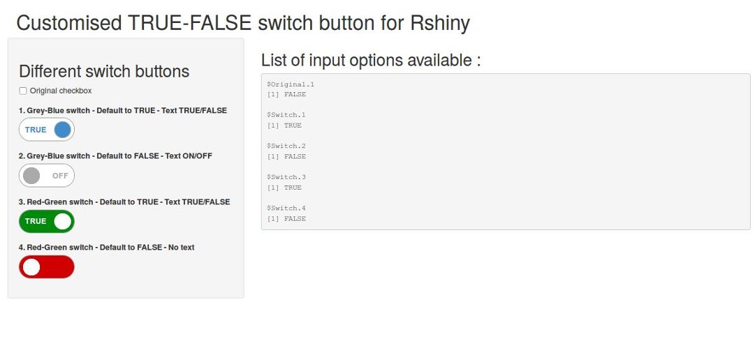
RShiny input controls have a nice design that allows to produce nice web interfaces in a very simple way, but the ‘checkboxInput()’ button is really boring compared to its friends…I was looking for a nice way to present a On/Off (or True/False) switch button in my shiny interfaces but I did not find any, at least not especially designed for Rshiny. Thankfully, there are many examples of switch button on the web, using pure CSS code or using a little javascript. I decided to take one in pure CSS and designed it so that it could be included in Rshiny with a few options.


Citation :
Merci de citer ce travail avec :
Rochette Sébastien. (2016, avr.. 19). "Un bouton On/Off pour RShiny". Retrieved from https://statnmap.com/fr/2016-04-19-bouton-on-off-rshiny/.
Citation BibTex :
@misc{Roche2016Unbou,
    author = {Rochette Sébastien},
    title = {Un bouton On/Off pour RShiny},
    url = {https://statnmap.com/fr/2016-04-19-bouton-on-off-rshiny/},
    year = {2016}
  }


