Painting maps: context
On the Grrr Slack, a mutual-aid Slack on R for French speaking people, Thomas Vroylandt showed the following maps asking how this could be done using {ggplot2} :
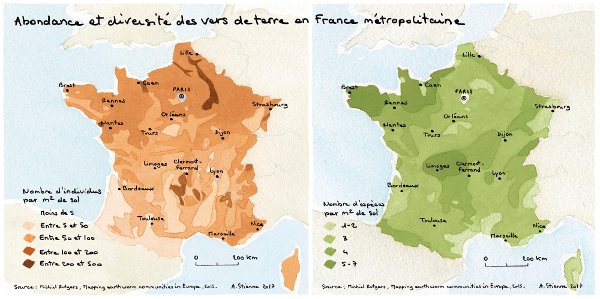
EDIT : This maps was originally presented on visionscarto.net with drawings by Agnès Stienne
Romain Lesur reminded us about this nice R-package on Github called ggpomological.
I found these maps really nice. As I like drawing maps, indeed, I was drawing French regional maps to prepare a tutorial, I decided to take a few minutes to install the library and change the look of my maps.
Libraries needed
As of today (2018-04-18):
- You need the development version of {ggplot2} to draw maps using
geom_sf. - Package {ggpomological} is on github only.
You also need my version of {ggsn} (“font-family” branch) if you want a custom font family inEDIT: Package {ggsn} has been updatedscalebar.
For a full authentic pomological look, you need to install {magick} and a handwriting font. Garrick Aden-Buie proposes a few fonts from Google Fonts:
- Mr. De Haviland
- Homemade Apple - default -
- Marck Script
- Mr. Bedfort
Personaly, I also like:
- Gaegu
- Nanum Pen Script -used here -
- Reenie Beanie
I let you find out how to install a new font on your OS and how to make it available in R. You may need extrafont::font_import().
# devtools::install_github("tidyverse/ggplot2")
library(ggplot2)
# devtools::install_github("gadenbuie/ggpomological")
library(ggpomological)
library(scales)
library(readr)
library(sf)
library(dplyr)
library(grid)
# devtools::install_github("statnmap/ggsn", ref="font-family")
library(ggsn)
library(units)
library(extrafont)
# extrafont::font_import()
Painting a first map
Let’s get some data. A map, of course ! I am currently working on a map of French regions with the repartition of the population by age classes.
You can download the data on my Blog tips Github repository.
# extraWD <- "."
if (!file.exists(file.path(extraWD, "Region_L93.rds"))) {
  githubURL <- "https://github.com/statnmap/blog_tips/raw/master/2018-04-18-draw-maps-like-paintings/Region_L93.rds"
  download.file(githubURL, file.path(extraWD, "Region_L93.rds"))
}
Region_L93 <- read_rds(file.path(extraWD, "Region_L93.rds"))
We represent the number of people below 20 years old in 2015 by region.
ggplot() +
  geom_sf(data = Region_L93,
          aes(fill = Age_0.19.ans), alpha = 0.75, colour = NA
  ) +
  geom_sf(data = Region_L93,
          aes(colour = Age_0.19.ans), alpha = 1, fill = NA
  ) +
  scale_fill_gradient(
    "Youngs (< 20y)",
    low = muted(ggpomological:::pomological_palette[2], l = 90, c = 70),
    high = ggpomological:::pomological_palette[2]
  ) +
  scale_colour_gradient(
    low = muted(ggpomological:::pomological_palette[2], l = 90, c = 70),
    high = ggpomological:::pomological_palette[2],
    guide = FALSE
  ) +
  theme_pomological_fancy(base_family = "Homemade Apple")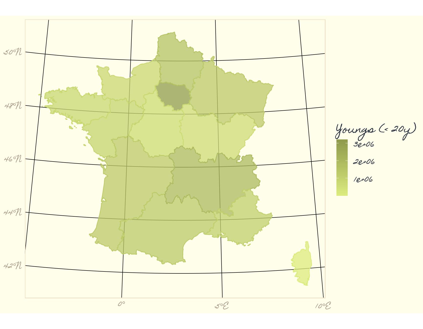
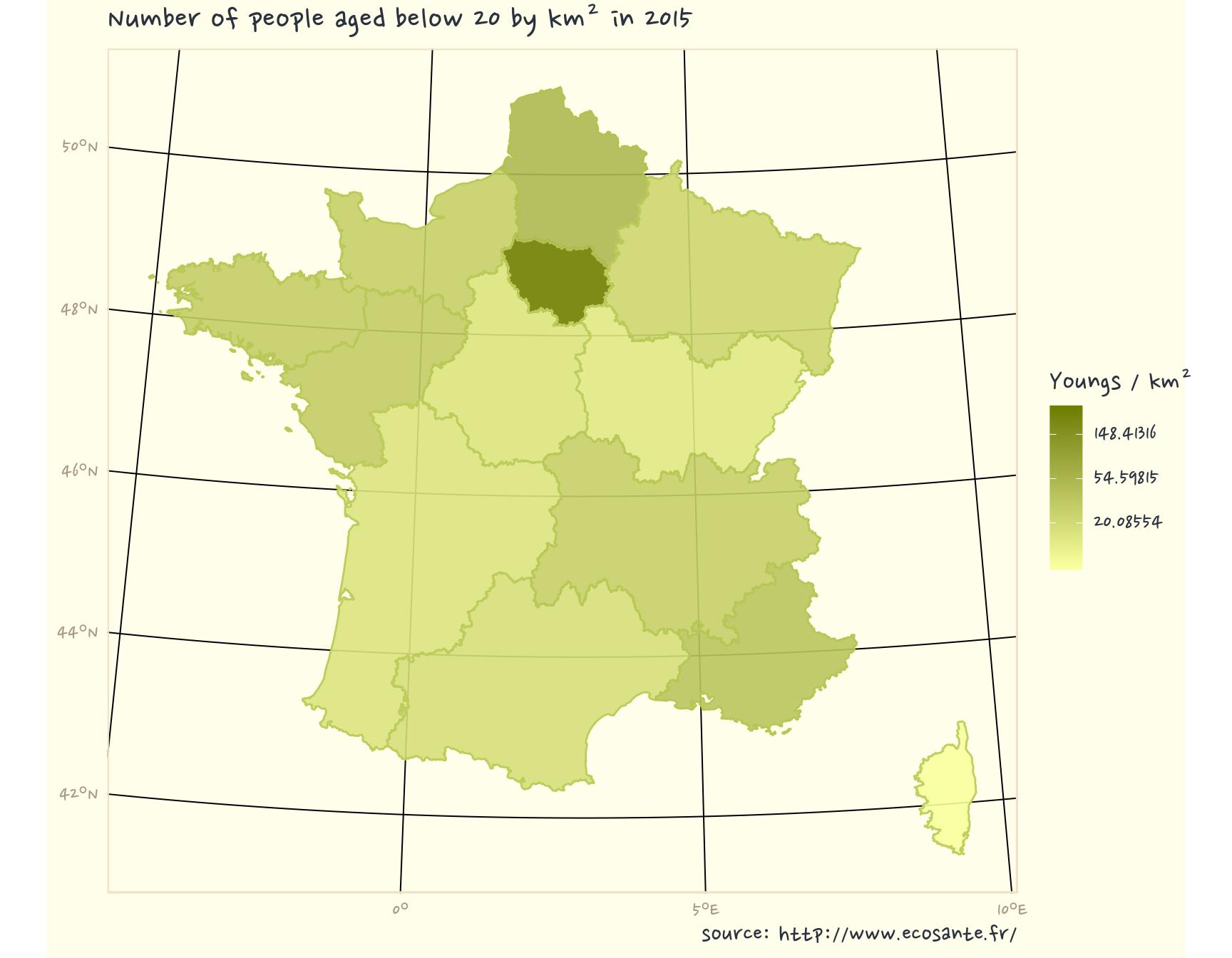
Change font family in {ggplot2} theme
If you downloaded “NanumPenScript” font, we can go further. We change values represented to number per km², which as more sense for comparison. We modify a little the color palette, add title and source.
Region_Prop_L93 <- Region_L93 %>%
  mutate(area_km2 = st_area(.) %>% set_units(km^2) %>% drop_units()) %>%
  mutate(Prop_20_km2 = `Age_0.19.ans` / area_km2)

ggplot() +
  geom_sf(data = Region_Prop_L93,
          aes(fill = Prop_20_km2), alpha = 0.9, colour = NA
  ) +
  geom_sf(data = Region_Prop_L93,
          aes(colour = Prop_20_km2), alpha = 1, fill = NA
  ) +
  scale_fill_gradient(
    "Youngs / km²",
    low = muted(ggpomological:::pomological_palette[2], l = 100, c = 70),
    high = muted(ggpomological:::pomological_palette[2], l = 50, c = 70),
    trans = "log"
  ) +
  scale_colour_gradient(
    low = muted(ggpomological:::pomological_palette[2], l = 80, c = 70),
    high = muted(ggpomological:::pomological_palette[2], l = 50, c = 70),
    guide = FALSE
  ) +
  theme_pomological_fancy(base_family = "Nanum Pen") +
  labs(
    title = "Number of people aged below 20 by km² in 2015",
    caption = "source: http://www.ecosante.fr/"
  )
Add all necessary information on the map
Let’s add some cities coordinates, transform as spatial feature, define coordinate system.
Add north and scalebar. I don’t know when we stopped adding North and scalebar on maps, but I learnt to never forget it. {ggsn} helps us doing it with {ggplot2}. We should also add information on projection.
Good to know : To add some geom_text over a map with {sf} data, it may be necessary that coordinates of the text are in the same coordinates system as the projection of the figure. Hence, we will modify “Regions” layer to be in non-projected geographic coordinates (EPSG: 4326).
# Add cities and project in Lambert93
cities_L93 <- tibble(
  city = c("Paris", "Rennes", "Lille", "Strasbourg", "Brest", "Bordeaux",
    "Montpellier", "Nice", "lyon"),
  lat = c(48.857256, 48.110867, 50.625291, 48.576816, 48.384679, 44.843019,
          43.609519, 43.694233, 45.749206),
  long = c(2.344655, -1.678327, 3.057288, 7.754883, -4.498229, -0.581680,
           3.877594, 7.245262, 4.847652)
) %>%
  st_as_sf(coords = c("long", "lat")) %>%
  st_set_crs(4326) %>%
  st_transform(2154) %>%
  bind_cols(st_coordinates(.) %>% as.data.frame())

# Plot
ggplot(Region_Prop_L93) +
  geom_sf(data = Region_Prop_L93,
          aes(fill = Prop_20_km2), alpha = 0.9, colour = NA
  ) +
  geom_sf(data = Region_Prop_L93,
          aes(colour = Prop_20_km2), alpha = 1, fill = NA
  ) +
  geom_sf(data = cities_L93, colour = "grey30") +
  geom_text(
    data = cities_L93, aes(X, Y, label = city), nudge_y = 20000,
    family = "Nanum Pen", colour = "grey20", size = 6
  ) +
  scale_fill_gradient("Youngs / km²",
    low = muted(ggpomological:::pomological_palette[2], l = 100, c = 70),
    high = muted(ggpomological:::pomological_palette[2],l = 50, c = 70),
    trans = "log"
  ) +
  scale_colour_gradient(
    low = muted(ggpomological:::pomological_palette[2],l = 80, c = 70),
    high = muted(ggpomological:::pomological_palette[2],l = 50, c = 70),
    guide = FALSE
  ) +
  theme_pomological_fancy(base_family = "Nanum Pen") +
  labs(
    title = "Number of people aged below 20 by km² in 2015",
    caption = "source: http://www.ecosante.fr/\nproj: Lambert93, epsg: 2154 aut.: S. Rochette, ThinkR."
  ) +
  xlab("") + ylab("") +
  north(Region_Prop_L93, symbol = 4, scale = 0.1) +
  scalebar(Region_Prop_L93, location = "bottomleft", dist = 200, dd2km = FALSE,
           model = "WGS84", box.fill = c("grey30", "white"),
           box.color = "grey30", st.color = "grey30", family = "Nanum Pen"
  ) +
  theme(text = element_text(family = "Nanum Pen")) +
  coord_sf(crs = 2154)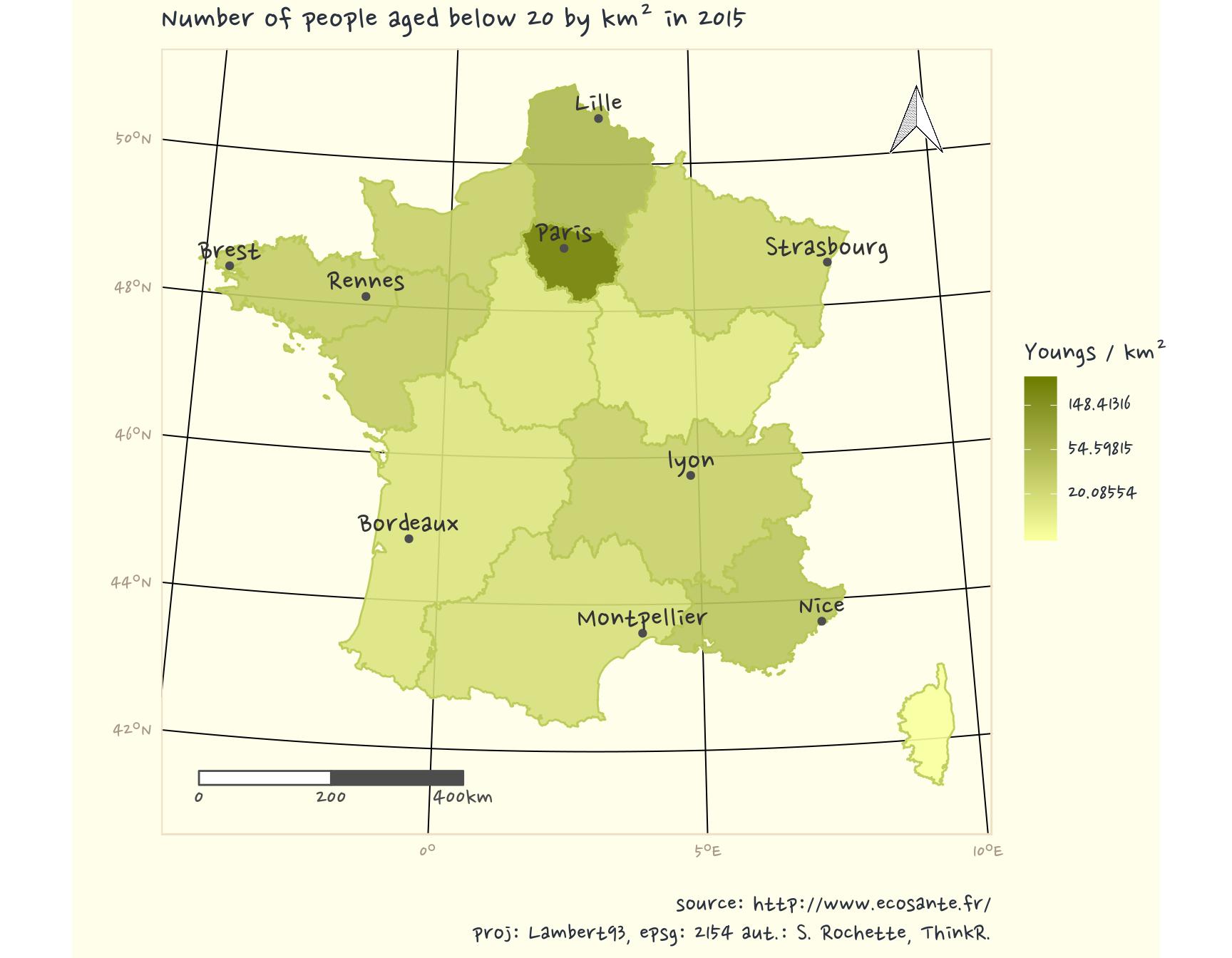
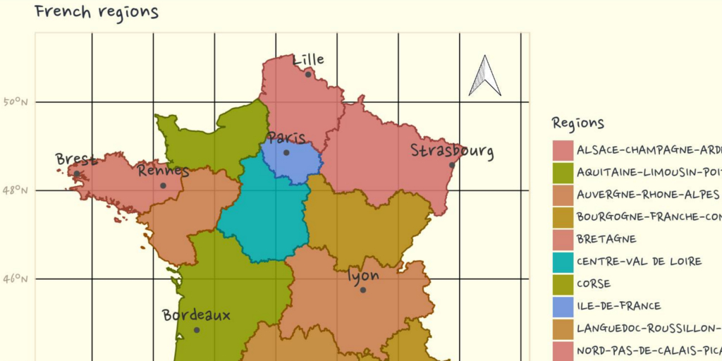
Another map with categorical data
Library {ggpomological} was first made for categorical data. So let’s use its palette with Regions. There are more regions than the number of colours in the palette, we will repeat some.
# palette
cols <- rep(ggpomological:::pomological_palette,
  length.out = length(Region_Prop_L93$NOM_REG))

ggplot(Region_Prop_L93) +
  geom_sf(
    data = Region_Prop_L93,
    aes(fill = NOM_REG),
    alpha = 0.9, colour = NA
  ) +
  geom_sf(
    data = Region_Prop_L93,
    aes(colour = NOM_REG),
    alpha = 1, fill = NA
  ) +
  geom_sf(data = cities_L93, colour = "grey30") +
  geom_text(
    data = cities_L93, aes(X, Y, label = city),
    nudge_y = 20000, family = "Nanum Pen",
    colour = "grey20", size = 6
  ) +
  scale_fill_manual(
    "Regions",
    values = muted(cols, l = 60, c = 70)
  ) +
  scale_colour_manual(
    values = muted(cols, l = 40, c = 70),
    guide = FALSE
  ) +
  theme_pomological_fancy(base_family = "Nanum Pen") +
  labs(
    title = "French regions",
    caption = "source: https://www.ign.fr/\nproj: Lambert93, epsg: 2154 aut.: S. Rochette, ThinkR."
  ) +
  xlab("") + ylab("") +
  north(Region_Prop_L93, symbol = 4, scale = 0.1) +
  scalebar(
    Region_Prop_L93,
    location = "bottomleft", dist = 200,
    dd2km = FALSE, model = "WGS84",
    box.fill = c("grey30", "white"), box.color = "grey30",
    st.color = "grey30", family = "Nanum Pen"
  ) +
  theme(text = element_text(family = "Nanum Pen")) +
  coord_sf(crs = 2154)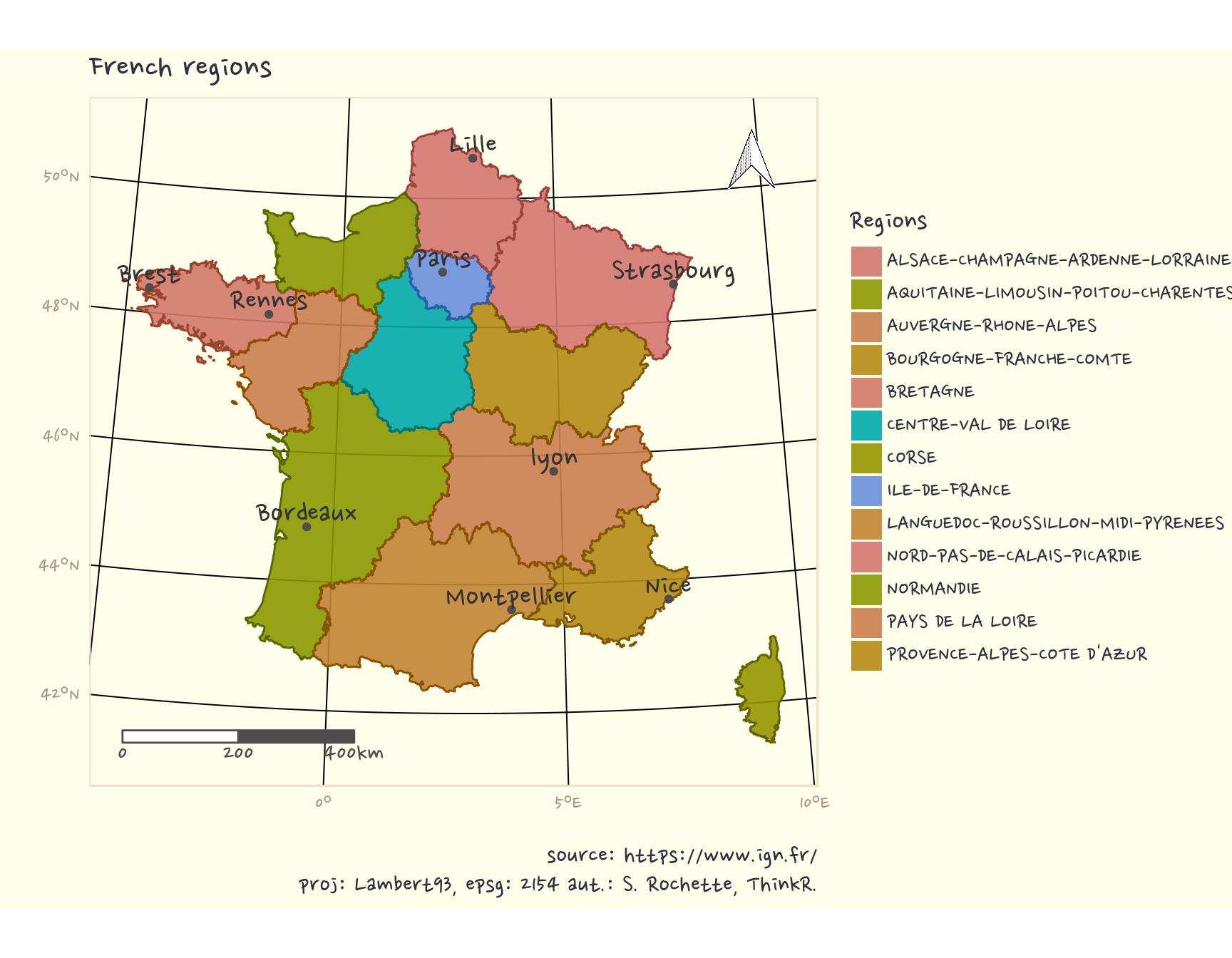
EDIT : Librairy {ggsn} has been updated after some of my propositions. It is now possible to draw scale and North on a projected map in {ggplot2}. I thus projected everything in Lambert93.
The R-script of this article is available on my Blog tips github repository
Citation:
For attribution, please cite this work as:
Rochette Sébastien. (2018, Apr. 18). "Draw maps like paintings". Retrieved from https://statnmap.com/2018-04-18-draw-maps-like-paintings/.
BibTex citation:
@misc{Roche2018Drawm,
    author = {Rochette Sébastien},
    title = {Draw maps like paintings},
    url = {https://statnmap.com/2018-04-18-draw-maps-like-paintings/},
    year = {2018}
  }